Is it time your guest bedroom got a little refresh?
Learn my process of designing a guest bedroom for Airbnb or your home.
The guest bedroom often comes at the bottom of the list of priorities when it comes to our homes. It’s a room can we can shut the door to and forget about when not in use. Add to that the reality that we don’t want to spend too much time or money on a space we’re not using every day - the poor guest bedroom can get a little bit neglected!
I had the scenario of designing a small guest bedroom on a tight budget for my sister in law’s beachside Airbnb. It needed to be a child friendly space, but equally inviting for adult guests. And don’t forget the vibe – Scandinavian and Coastal all the way!
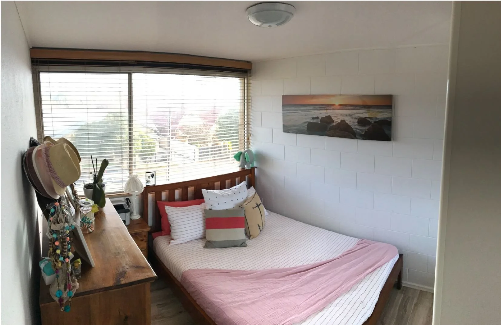
BEFORE PHOTO.
Here’s a look at the before photo of the guest bedroom. As you can see it was perfect for just my sister in law, but needed a total revamp if it was going to work well for rental guests.
As with all real estate photos, the room looks much larger than it actually was. The plan was to create a comfortable space to accommodate two people. We decided on two single beds to allow more flexibility for guests and younger children. The real question was – what was the best layout?
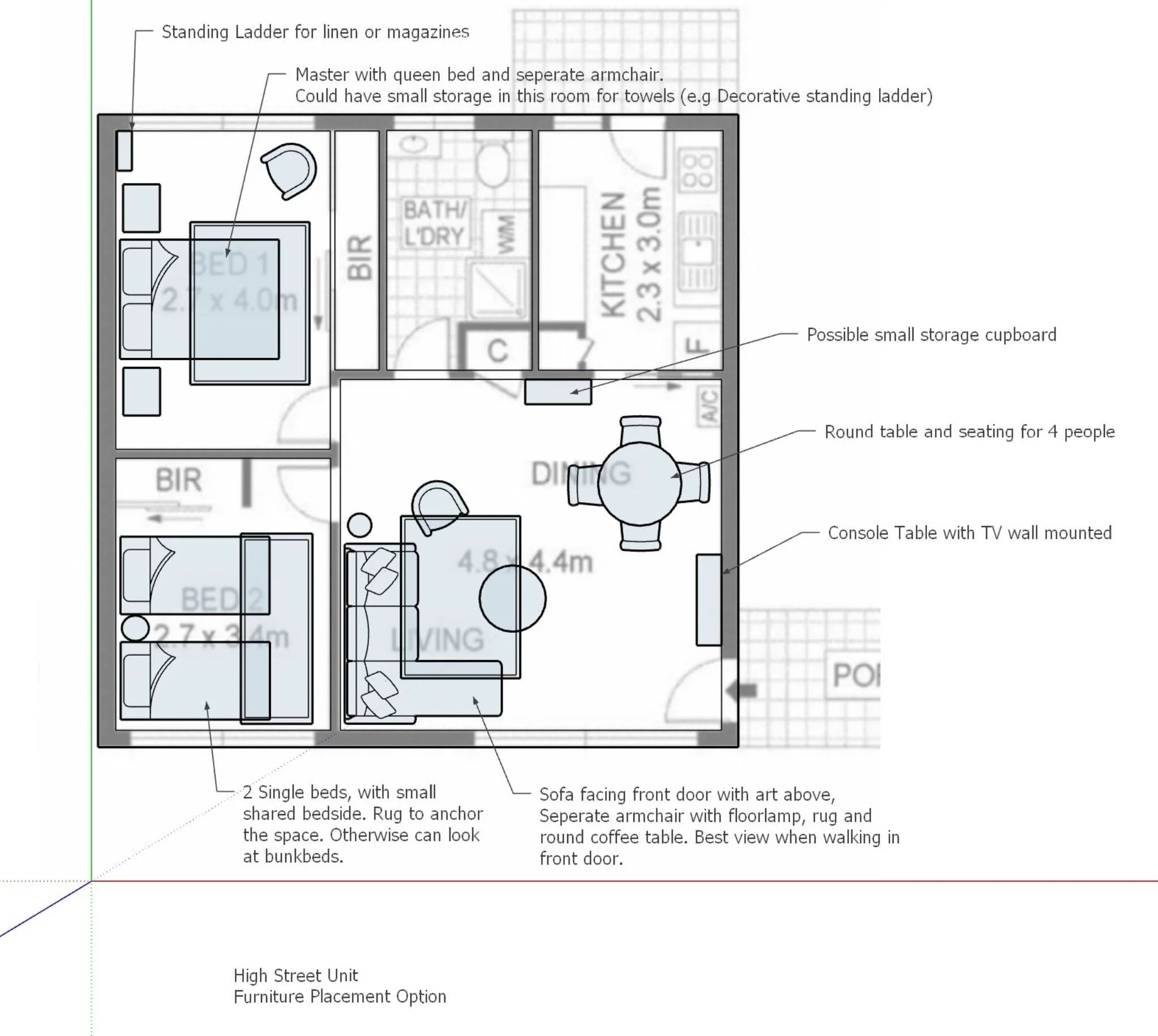
LAYOUT IDEAS.
Here’s a look at my initial suggested floorplan drawing. The bottom left room is the guest room, and I originally had the beds orientated along the solid bessa brick wall. When I actually spent time in the space though, I decided it felt more spacious having the beds running along the window wall. Looking at a floorplan is one thing but getting an actual feel for the space makes all the difference!
Tips for initial concept phase of designing a guest room.
TIP 1: Spend time in the space at different times in the day. Take note of the amount of sun the room receives. This will help you decide on the best paint colours, window coverings and the heating/cooling needs your guests may have. Even take photos of the space in the morning, midday and late afternoon to get a sense of how the room feels throughout the day.
TIP 2: Take out some or all of the furniture if practical to get a good feel for the potential of the space. If your guest room has been set up the same way for a long time, removing the furniture helps you see the room’s dimensions in a fresh light.
TIP 3: Get out your masking tape! Now’s the time to tape out how much room your bed, dresser, bedside tables etc will take up in the room. And don’t forget your rugs, tape out the difference rug sizes you might be considering before you excitedly purchase the wrong size. Also remember to mark out the heights of your furniture and art pieces too. Often the proportions of the room don’t work so well when your beds, bedsides and other shelving aren’t thought of in relation to each other.
3D DESIGN DRAWINGS.
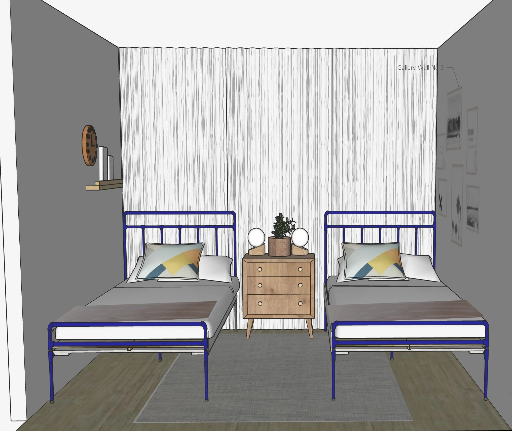
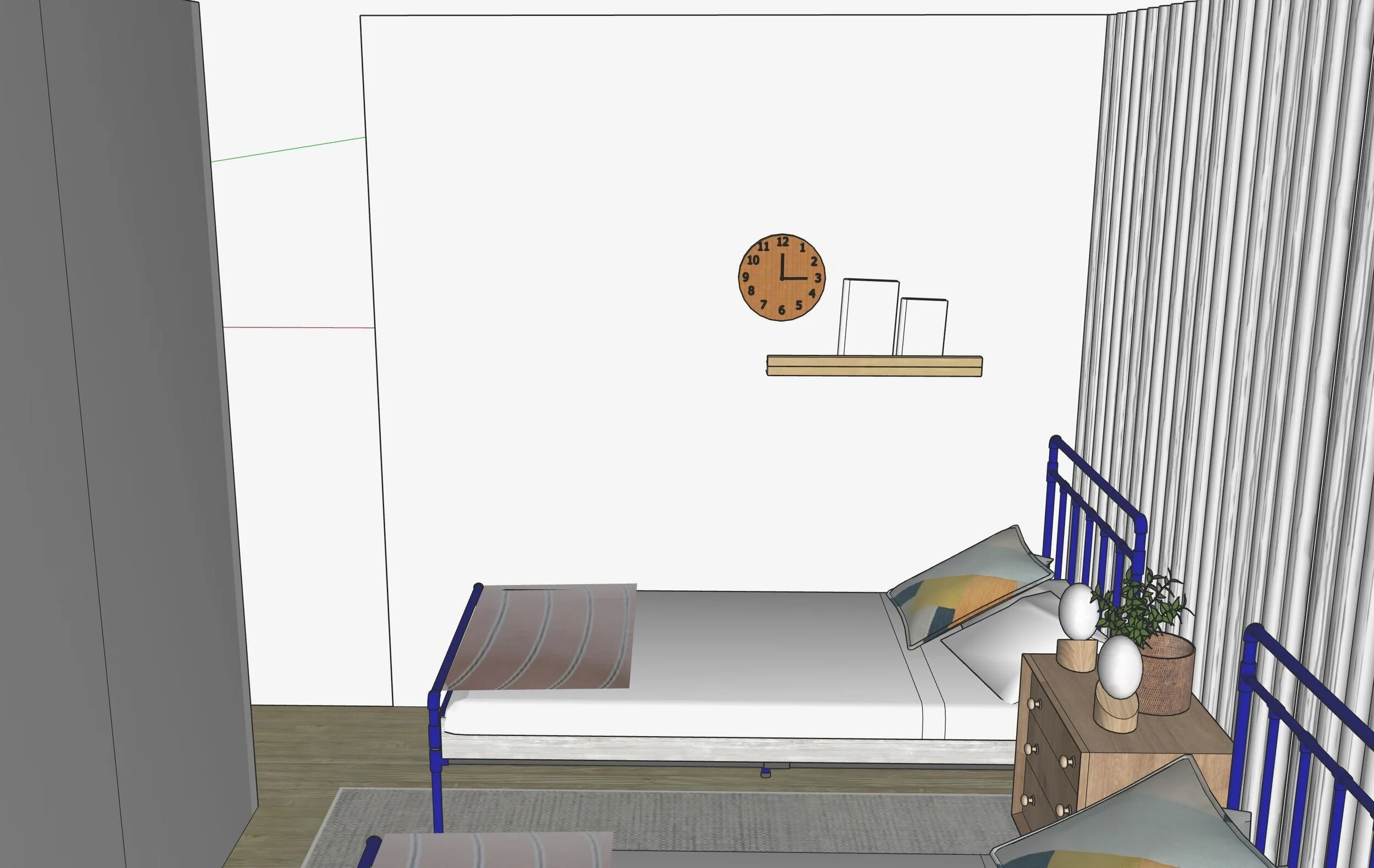
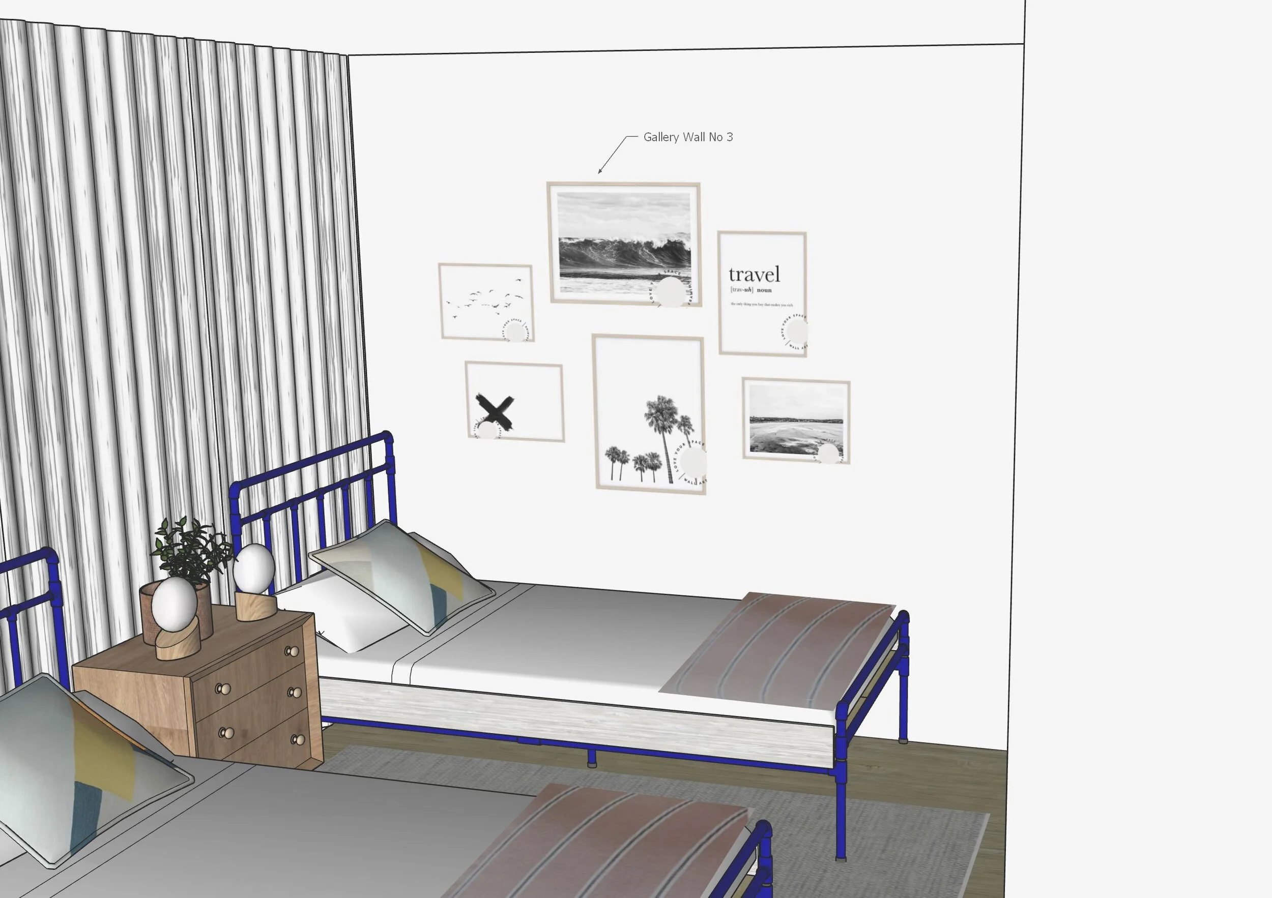
Here’s the 3D drawings that helped to visualise how the new guest room would materialise.
This orientation of the beds created a more open feel as you entered the room. This layout also allowed for the best access to the built-in wardrobe, which housed children’s toys and travel cot.
It was also important to cover the wood venetian blinds that weren’t going to be replaced. While they functioned well for privacy and sun block out, adding floor to ceiling sheers created that sense of height, a lovely filtered light and helped the room feel more finished and cocooning.
From this view these initial concept design drawings showed my vision for creating some interest on this wall of the guest room. It was important to have some practical and beautiful elements, such as a clock and small shelf to house some travel magazines, without it competing for the hero feature which was the art pieces on the opposite wall!
Tips for the space planning phase of designing a guest room.
TIP 1: Think about all four walls of your guest room and what your guests will see looking at each wall. It’s good to have some interest on perhaps two walls, with one wall being the feature that you want to highlight.
TIP 2: Consider your window coverings! Daggy curtains are not a design feature and updating them may be the best thing you do to create a warm and welcoming space. Think about whether you want your window coverings to be a feature with a pattern or bolder colour, or if you aim for them to recede into the overall design.
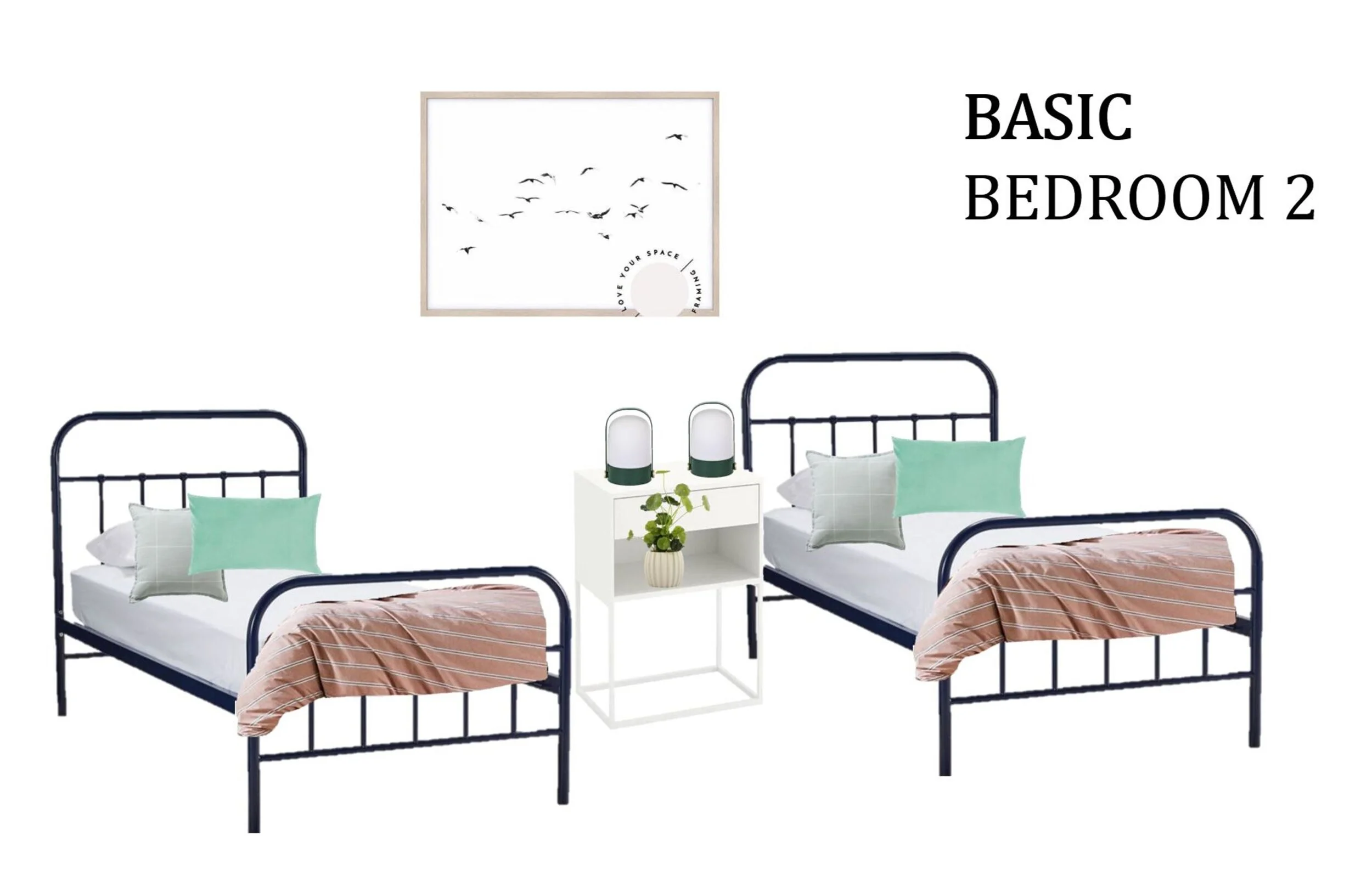
Here was the plan for how the guest room could look when guests entered the space. Having a feature gallery art wall that people would notice as soon as they enter the room adds interest and personality so effectively. Aesthetically it was all about adding some colour into the room with deep navy beds and sage green and rust bed linen. For this to work, without over powering an otherwise quite muted space, I chose to keep the art work black and white with matching frames and a neutral toned rug and curtains.
Tips for the styling process of a guest bedroom.
TIP 1: When using colour sometimes less is more. Choosing to use bold colour works wonderfully when paired with more neutral colours. This way the room remains balanced and the colour use is powerful and special.
TIP 2: Don’t forget to incorporate texture. Hints of natural woods always brings warmth, as does indoor greenery. Rugs are the perfect way to introduce added texture too.
TIP 3: Think about adding something personal and meaningful to your guest space. Whether you highlight something from your location, the style of your home, the values of your family, it’s these personal touches that take your space from bland to memorable.
SNEAK PEEK OF THE AFTER LOOK.
In my next blog post I will reveal all the AFTER PHOTOS of what became a fresh and welcoming guest bedroom. It was a guest bedroom makeover on a budget, and space was of a premium, but with careful thought and consideration proved that lovely things can come in small packages!
Perhaps this blog has inspired you to transform your guest bedroom. Do you need help with layout or furniture choices? Whether for an Airbnb endevour or your own home, I can help take out the guess work on budget, style and save you pesky mistakes that you just don’t know about until you make them!
Contact me at bec@designrelease.com.au - I’d love to help you in your room transformation.


